The Evolution of Website Design
January 7, 2019
Sites started off as nothing but texts and links. Today, web pages are mobile-friendly, optimized for search engines, and design-orientated. When you work with a firm offering website design in Phoenix today, you’re receiving a lot more than what you would’ve gotten in early 2000’s and 90’s.
Design Timeline
Text and Hyperlinks
Anyone who’s old enough to remember what the first sites online looked like will tell you that it consisted of nothing but texts and hyperlinks. In fact, the first ever website contained only information on what the web was and how to use it along with a few basic instructions.
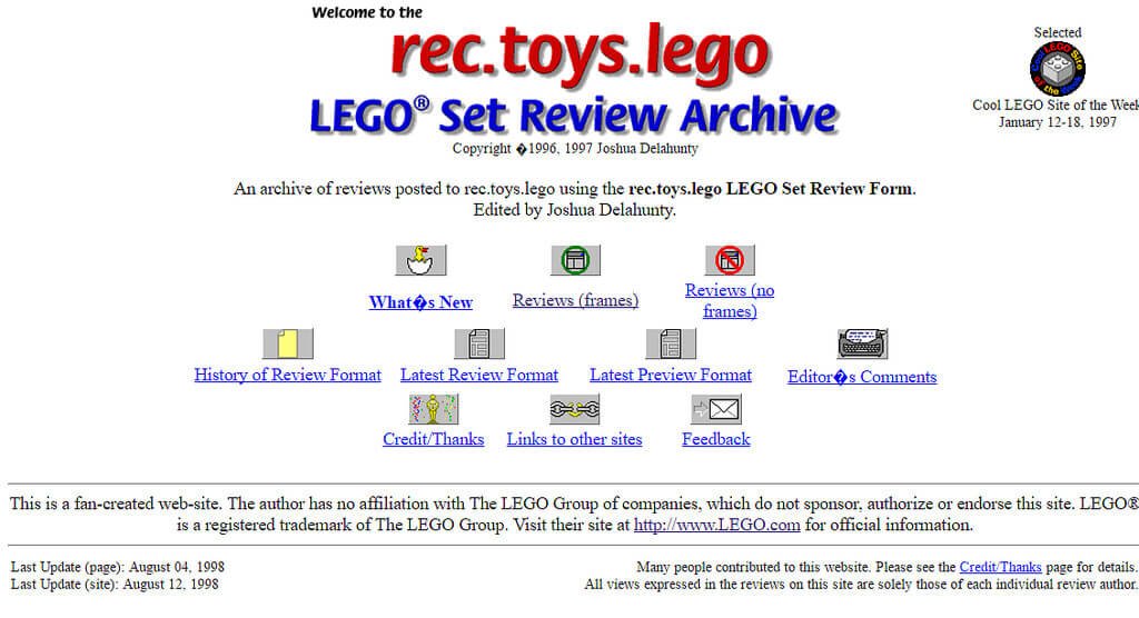
Images
Vertically-structured pages heavy with texts and a few graphics soon followed. These pages used hypertexts to provide navigation for the sites, with the hyperlinks—underlined and in blue—standing out.
Tables
After that, designers started using the Graphical User Interface. This made it easy for a lot of sites to include images and icons. Designers also started using tables to organize online content. With tables in the web structure, people now had more choices in terms of design components to put on their pages.

Flash
In the late 1990s, the software Flash was introduced, providing the means to incorporate video, music, and animation into the pages. That made for a more dynamic and interesting audio-visual experience. The Flash software is often regarded as one of the many technological as well as creative breakthroughs in web design, improving designs and pages. Browsing experience becoming much more sophisticated.
CSS
With the emergence of social media came tools that would provide even greater flexibility in the way people would communicate. That’s the context into which Cascading Style Sheets or CSS was born. Used to define different styles across multiple pages, it made design work even easier.
Flat Design
This is the design we see in sites today. Flat design is based on the idea that a single website must have the ability to adapt to a slew of display environments. That’s why we now have mobile-friendly sites.
Whether you need your site to be mobile-friendly or are looking for experts in website design in Phoenix to come in and upgrade your outdated pages one thing is certain: websites have come a long way. And with designers who work tirelessly to improve the consumer experience, you can expect more fascinating changes to come.
Contact Fasturtle Digital today and make sure your website design is earning you business.
")


